A rebrand of WingTrades.com current logo to allow for a more memorable and marketable logo. The design brief asked for a logo that can be used in statements that begin with “W”, replace said “W” with the logo and have a strategic marketing platform.
WingTrades.com is a trading education company startup. https://wingtrades.com/#!map
Brand Iterations
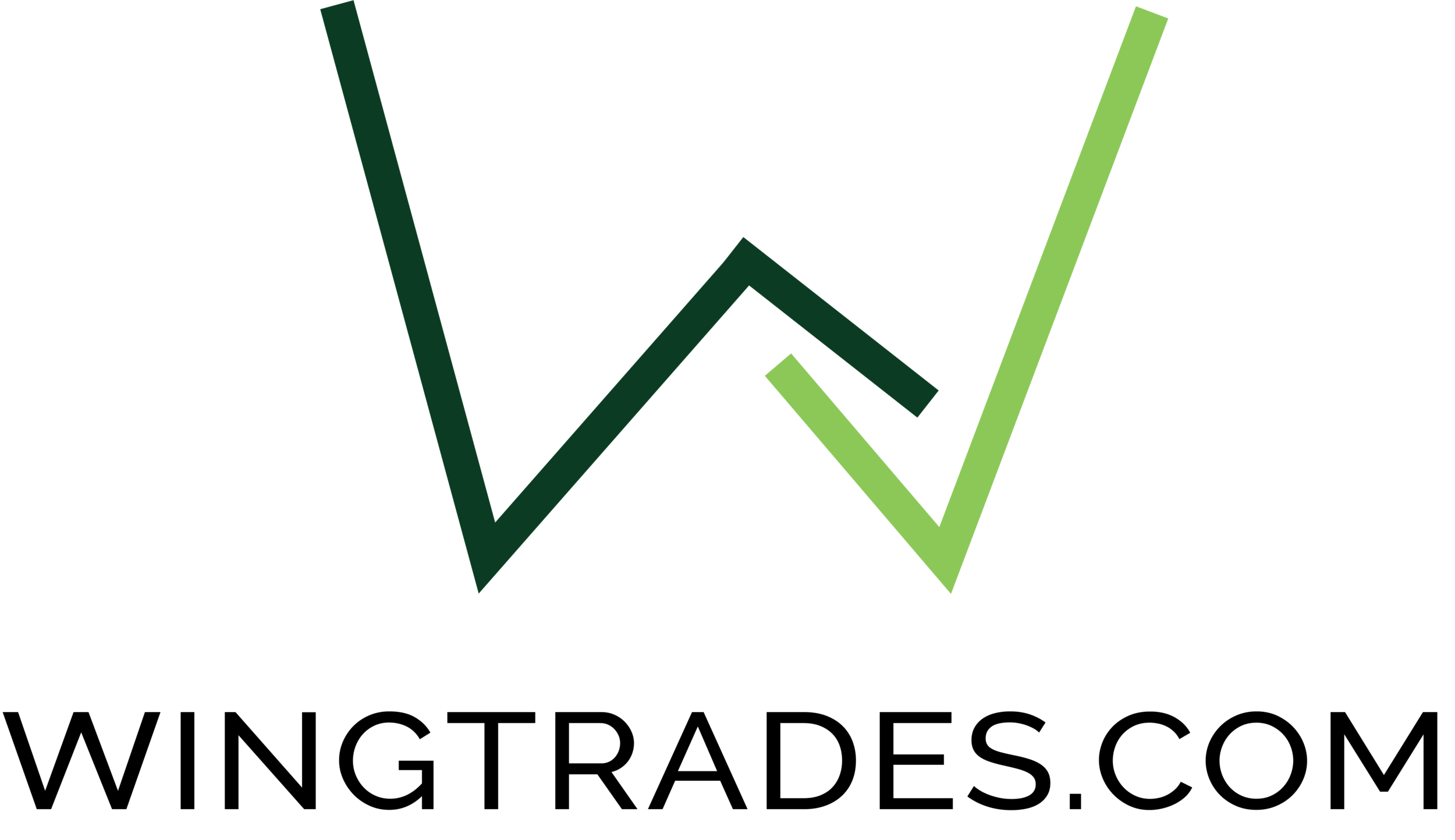
Brand series used interchangeably on merchandise and website. In the second iteration, a circle is used to represent the holistic and inviting trading community. The “W” is similar to the charts when trading - showing that there is not just an upward trend, there is ups and downs to trading. Colors were predefined by the company. The second iteration shown uses the company image used from the beginning.
Process
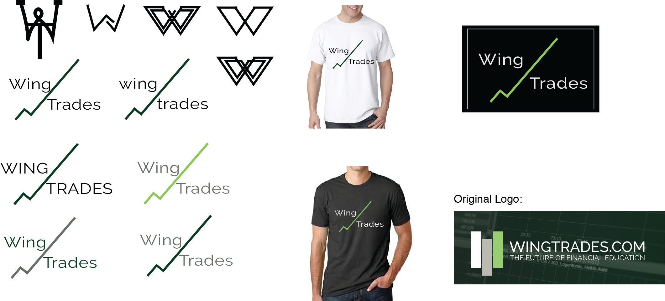
After completing over 400 sketches on paper, I narrowed it down to 6 designs. These 6 designs were developed digitally and placed on merchandise. These designs were sent to the executive team. A unanimous vote for the logo second from the top left was determined as the “winner”.
Original logo has three candles to represent trading charts - self-explanatory for traders, not for non-traders. Company desired a unique logo.
The technical applications used to develop these designs were Adobe Illustrator and Photoshop.


