Project 1
Milestone 1
The topic for this project has been something that I have always been curious about and studied in high school as well - the leading causes of death in the US versus the amount of money towards funding research. The intended message of this is to show that the leading causes of death are not receiving near as much funding as many may believe. It is hard for funding to be accessible to numerous research hospitals in the nation, however, is there a way to make it more accessible?
The inspiration behind this topic is the fact that throughout my high school career I was set on wanting to be a doctor or surgeon. I took numerous online courses through my school to understand how to diagnose a patient, what research needed to be done to understand different symptoms, and how to identify the cause. Upon first arriving at CU Boulder, I was a chemical and biological engineer with the desire to go into medical school upon graduation. I found that that wasn’t the path for me but I am still interested in the medical industry and what is currently happening within the research realm. The intended audience that I hope to reach with this project is current medical industries and people between the ages of 18 and up who can have an effect on the amount of money going towards research.
The general aesthetic for this project is I want there to be an interactive graph that keeps up to date with the amount of deaths in the leading causes of death in the country. As time progresses, I want there to be live data showing of the deaths. Additionally, I want there to be a global map with potentially circles and the size of the circles represents how much each country spends on research annually. There will be little plus signs with a question and the answer will appear when the plus sign is clicked and disappear when the replacing minus sign appears. This will allow the users to almost quiz themselves about information but not have it be a real quiz counting their points. This will allow for interactivity from the user and an intuitive site.


In terms of the APIs I wish to use in this project, I will probably use the Canvas API to allow for the space for the global map and the chart data. Additionally, the jQuery library will be used to allow for the expansion and hiding of text on the page. The Incubator Echarts library will be an effective library I will need to experiment with that could provide the interactive and intuitive chart I am looking for to display the data of leading causes of death. If that doesn’t prove to be effective in real time updating, there is another JavaScript library that can also be used within jQuery which is the CanvasJSChart, which allows live updating of data to be shown. To allow the amount of money put towards medical research to be shown on a map that is interactive for the user, the JavaScript library - Interactive Maps Generator will be used.
In addition to the general style of the website, some sites that I will gather data from are - for death statistics overall to be used in the information quiz area (FastStats), for live accounts of US deaths (Worldometers), another live statistics site that provides a lot of other resources linking from their page (World Clock), list of countries and the amount of money spent on research (Wikipedia), and the funding for research in the US and what for from government data (NIH Categorical Spending). Additional information may be needed as the project continues, but nearly all of the data that I found on these websites is the data required to make the website get across the message.
Milestone 2
As I started to do more research on the possibility of live updating data, I realized, it is way beyond my level of knowledge and needing to include more than just one or two libraries and APIs but requires the use of many to develop. I decided that instead of doing that, I would create a line graph showing the increase of deaths in the respective causes over the years. The lines will be separated by color and will have a legend on the side to allow for the comprehension of the chart. As much as I would have loved to accomplish the live updating data, it did not seem possible with my current level of understanding. The line graph will be animated to allow for the slow progression to be shown and the user can set how fast they will want to see it with a slider.
After many failed attempts to develop a chart over time due to the lack of data available for each subcategories in a pre-made chart and the complexity of developing said charts, I was able to get the CanvasJS library to work to display a simple chart to build off of.
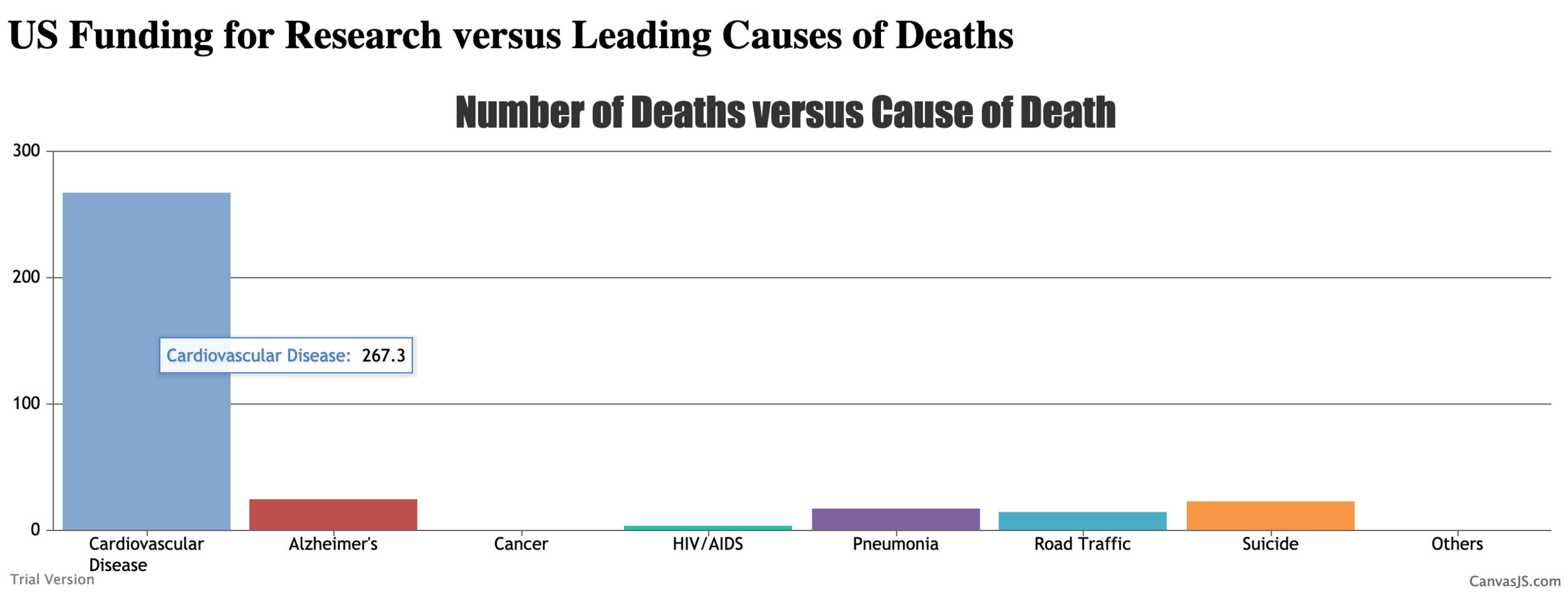
As seen in the above chart, it is incredibly difficult to see what the actual data points are without some sort of label. The idea I wish to implement here will be to have the data shown when the user hovers over the data. Upon further looking into the CanvasJS library, I found that it is already built into their JavaScript file for the library. When hovering over the data, you will find the data value appears over the bar in the chart.
From here, I want to have a slider or a button that will allow for the chart to be animated and change to the current data as of today for the number of deaths per 100,000 people to allow a comparison. To start, I want there to be an animation that happens upon the first onload of the page. The bars on the bar chart gradually grow to the size that the statistics indicate.
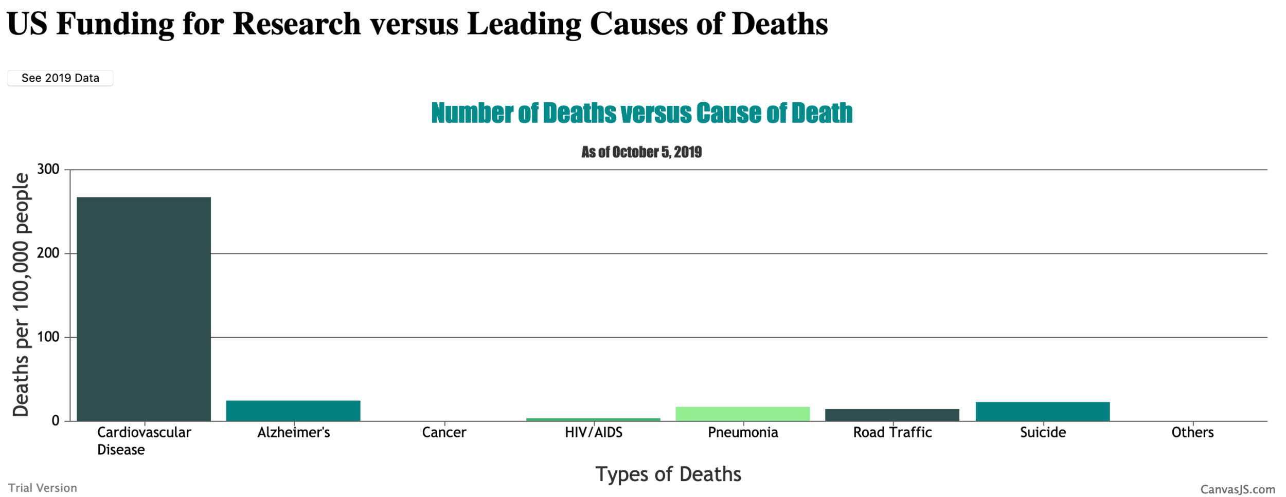
I was able to figure out how to work the stacked column chart and get the current data as of October 5, 2019 input. Additionally, I reset the colors for the column chart and added on axis title. I still need to animate it more.
This is a very beautiful design but I still felt like something was missing. I decided to use a button to change the data from 2010 to 2019 for the user. This isn’t very efficient currently but this is adding a similar stylistic appeal that I am seeking with the data changing.
The next difficult step of this project is to figure out how to work the Interactive Maps Generator API. I started with getting the basic world map without data and with changed colors to match the theme I have going thus far. The map is the very basics to begin using this API, from here I need to add the interactivity element that goes along with each country. The interactivity will allow for the amount of research money spent on medical illnesses to be shown when hovering over the continents.
I then discovered that adding to the continents to separate out the values would be difficult as each area has a set number value and they are not clearly defined in the documentation. Instead, I found that when completing the world map by country, it allowed for the 2 letter country code to be used to access each country that has recorded data of the amount of funding put into research. This made it a very tedious task entering the 91 countries and their data but it made it more understandable in terms of what the data was representing for the user (and more interactive). The semi-finished result for the 91 countries on the map are shown below:
As you can see, when you hover over the different countries, the data for that country shows (this took a long time of data entry)! Even with the current color scheme matching that of the colors displayed with the bar chart above. It doesn’t make sense why the colors are arranged the way that they are. So, I decided to add a legend and the colors on that legend associate with whether the country spends between that certain amount of money on research.
Getting the legend to display how I want to is proving to be much more difficult than expected while using this library. I was not able to figure this out before the end of Wednesday night, so this will be a continued challenge I will need to overcome for the final Milestone. The final addition to my website that I wanted to show in more pseudo-code was the aspect of including the quiz like question and slide toggle answer. This allows users to think about the question, then click to discover the answer efficiently but does not act like a quiz in the sense that it does not track your answer. The general layout is described with the screenshot below:
The next step will be the legend and adding the information necessary to complete the quiz section (done through research). Additionally, adding stylistic elements will help to improve the page aesthetic. For the most part however, the functionality of the project is laid out.
Milestone 4
In terms of tactical development of this web page, I am really proud of myself. I think that the execution of using three separate additions (APIs and Libraries) really was a big challenge but I executed it well. I had a difficult time getting the legend to work with the world map that I constructed, however, once I realized it was not an additional library or API I needed to use and needed to find a way to hard code it in with vanilla JavaScript, I got it to work. It was a lot of effort to develop this project overall. If I had more time, I would have liked to add on an additional feature with the CanvasJS at the top of the web page showing a bar chart. I would have liked to make an aside bar so when you hover over one of the elements in the bar chart, information would appear in this side bar. It could have been possible but I just overestimated how much I could do in the short time allotted. Furthermore, there could have been more work in the design realm of the development of this web page. It was a good and cohesive design but there definitely could have been more design elements added to really make the web page go from a scholar level to a professional website. I did not construct an adaptive web page which would have been the next step - to make it work effectively and intuitively on mobile devices.
Overall, I do like the final product I produced. There are areas for improvement with the tactical (the addition of the side bar) and the design (overall flow and adaptivity), but for the level of knowledge I started out with on this project to now, I am really impressed with the amount I learned.


